📁 Uploader
Makes it simple to store and serve large files on Supabase.
In this section, we will guide you on how to effectively use the uploader element to upload files from your Bubble.io app to a Supabase Bucket.
Setup the uploader component
Add the element Supabase Uploader to your page.
You can customize the uploader component to fit your unique style.
Core settings
- Name
Data type- Type
- App type
- Description
Select
Uploader (Supabase)for this field.
This type is automatically defined by the Supabase plugin and allows exposingFilesandLast Fileuploader states.
- Name
Bucket Name- Type
- string
- Description
Name of your bucket on Supabase
- Name
Path- Type
- string
- Description
The file path, without the file name. Should be of the format
folder/subfolder/
- Name
Filename- Type
- string
- Description
Filename including the extension (e.g. picture1.png ). Let empty to use the default file name.
- Name
Randomize Filename- Type
- boolean
- Description
When this option is enabled, the plugin appends a random UUID string as a suffix to the filename before uploading (e.g., picture.png becomes picture-(uuid).png).
- Name
Append File Extension- Type
- boolean
- Description
Automatically append the file extension if the filename does not contain it
- Name
Allow Overwrite- Type
- boolean
- Description
When this is set to true, the file is overwritten if it exists. When set to false, an error is thrown if the object already exists.
- Name
Accepted File Types- Type
- string
- Description
List of allowed file types. By default all types are accepted. List of types separated by a new line.
- Name
Min File Size In KB- Type
- number
- Description
By default there is no limit on minimum file size.
- Name
Max File Size In KB- Type
- number
- Description
By default there is no limit on maximum file size.
- Name
Allow Multiple Uploads- Type
- boolean
- Description
Enable uploading multiple files.
- Name
Max Files- Type
- number
- Description
The maximum number of files that can be uploaded. Used only when Allow Multiple is true. 0 means there is no limit.
- Name
Minimum upload duration- Type
- boolean
- Description
This option guarantees that file uploads display a progress bar for at least 750ms. Disabling it can improve upload performance when handling many files simultaneously.
- Name
Maximum parallel uploads- Type
- number
- Description
Maximum number of files to upload in parallel. The default value is 2.
Preview settings
- Name
Allow image preview- Type
- boolean
- Description
Enable or disable preview mode.
- Name
Preview min height- Type
- number
- Description
Minimum image preview height. Defaults to 44.
- Name
Preview max height- Type
- number
- Description
Maximum image preview height. Defaults to 256.
Style settings
- Name
Panel Background Color- Type
- Color
- Description
The background color of the uploader drop area
- Name
Panel Border Style- Type
- Dropdown
- Description
The style of the uploader drop area border
- Name
Panel Border Color- Type
- Color
- Description
The color of the uploader drop area border
- Name
Panel Border Width- Type
- Number
- Description
Panel border width in pixels
- Name
Panel Border Radius- Type
- Number
- Description
Panel border radius in pixels
- Name
Label Color- Type
- Color
- Description
The color of the main label
- Name
Label Font Size- Type
- Number
- Description
Label Font Size in Pixels
- Name
Label Font Weight- Type
- Number
- Description
The font weight of the label
- Name
Action Color- Type
- Color
- Description
The color of the action text
- Name
Action Decoration Color- Type
- Color
- Description
The underline color for the action
- Name
Action Font Size- Type
- Number
- Description
Action Font Size in Pixels
- Name
Action Font Weight- Type
- Number
- Description
The font weight of the action
- Name
File Panel Background Color- Type
- Color
- Description
The background color of the file and file panel (used when dropping an image)
- Name
File Panel Background Color On Success- Type
- Color
- Description
The background color of the file panel in case of success
- Name
File Panel Background Color On Error- Type
- Color
- Description
The background color of the file panel in case of errors
- Name
File Panel Buttons Background Color- Type
- Color
- Description
The background color of the action buttons
- Name
File Panel Text Color- Type
- Color
- Description
The text color of the file status and info labels
- Name
File Panel Icons Color- Type
- Color
- Description
The icon color of the action buttons
- Name
File Panel Focus Ring Color- Type
- Color
- Description
The color of the focus ring (around action icons)
- Name
File Panel Focus Ring Width- Type
- Number
- Description
The width of the focus ring (around action icons)
- Name
File Panel Secondary Text Color- Type
- Color
- Description
The text color of the labels under filename
Labels settings
- Name
Label Main Text- Type
- string
- Description
Message shown when an invalid file is added
- Name
Label Action Text- Type
- string
- Description
Main action text displayed on the panel
- Name
Message File Type Not Allowed- Type
- string
- Description
Message shown when an invalid file is added
- Name
Message Max File Size Exceeded- Type
- string
- Description
Message to show when max size is exceeded
States
The element exposes the following state:
Success: return "yes" if the upload has been successful.Is Upload: return "yes" if the last action is an upload.Status Code: the code returned by Supabase.Status Message: the message returned by Supabase.Files: list of files uploaded through this component.Last File: details of the last uploaded file.
The file state contains the following attributes:
id: ID of the file object on Supabasename: filenameextension: file extensionurl: URL of the filefullPath: path to the file, including the bucket namepath: path to the filesize: the file size in KB
Events
The element triggers the following event:
State has changed: triggered when the uploaded'state has changedFile Upload Success: triggered after the file has been successfully uploaded to the bucketFile Upload Error: triggered when an error occurs during the file upload to the bucket
Action Reset Uploader
Reset the states of the Uploader component to its initial configuration.
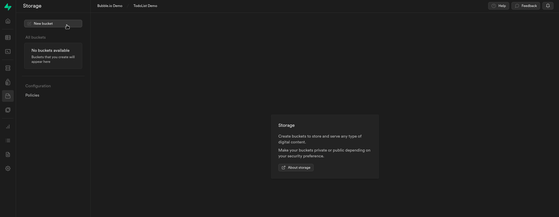
Setting-up a Supabase bucket
The first step is to create a new storage bucket. This bucket will serve as your dedicated cloud space, allowing you to easily upload, organize, and access your files from your Bubble.io app.
You can create a bucket using the Supabase Storage component or through the Supabase dashboard.
Create a Bucket through the Supabase dashboard
Create a bucket on Supabase
Please note that this settings primarily serves as a basic demonstration of how to use Supabase Storage. It may require additional modification or extension to be used in a production environment.
Create policies
At this point, we will establish policies that enable authenticated users to:
- Read files from the selected bucket
- Upload files to the selected bucket
- Update files to the selected bucket
- Remove files from the selected bucket
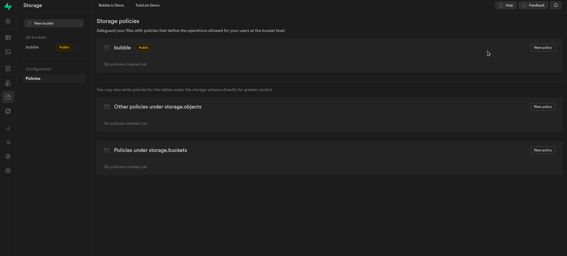
Create policies on Supabase
Do you need any help? Feel free to reach out